The Brief
As an innovative startup, AirDeska needed an identity that was as friendly, modern and fresh as their thinking. They asked for an eye-catching icon to apply to stickers in windows of locations that passers by couldn't miss.
The Design
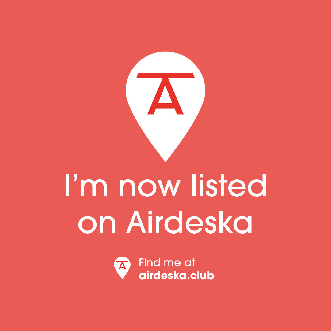
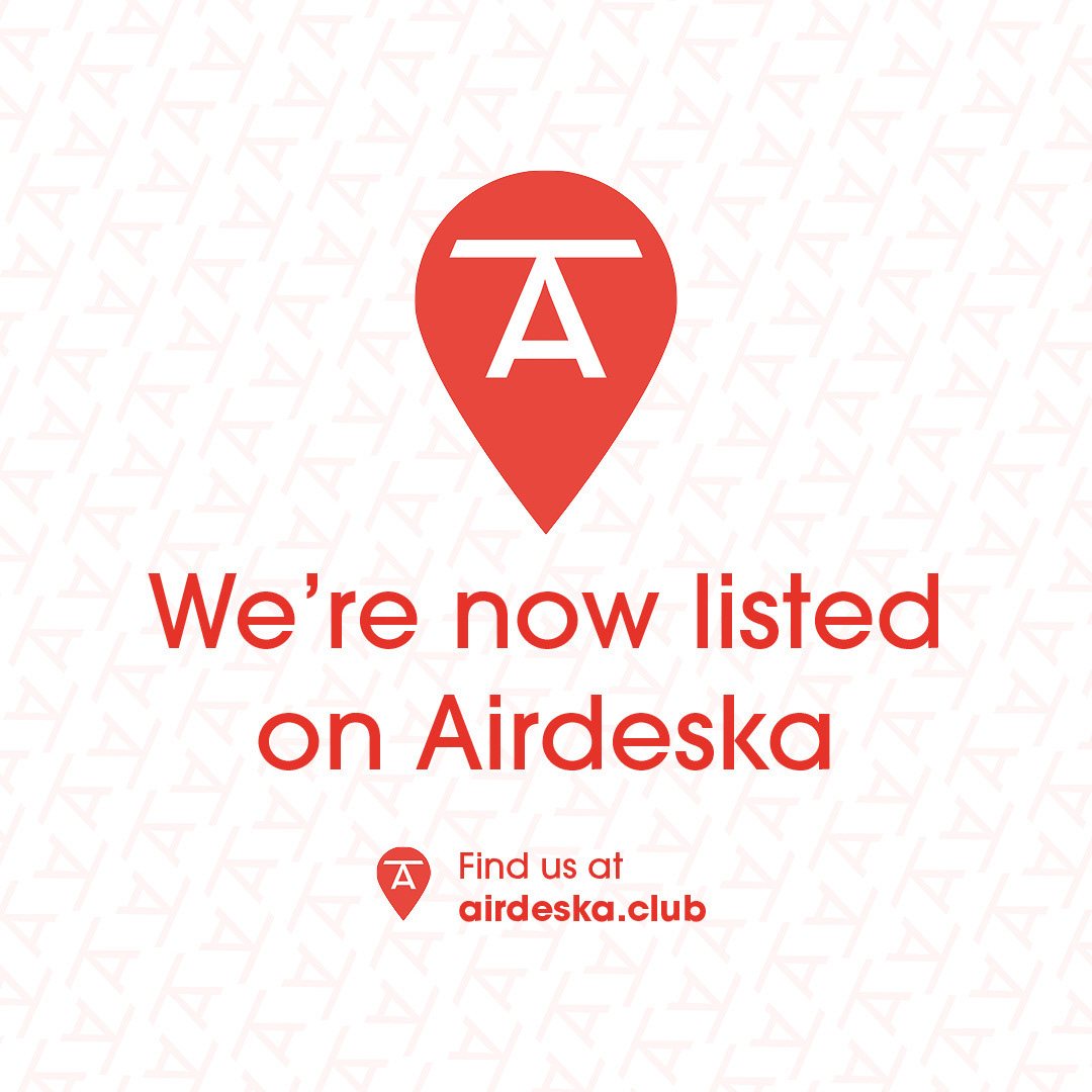
The mark needed something that could stand alone, and be recognisable without the name attached, and so I took the shape of a Desk and applied it to the 'A' of AirDeska. This triangular shape also tessellated very well, and became a secondary pattern to apply across other design collateral, such as business cards and banners. A bright friendly red was the obvious choice to stand out, and paired well with a crisp off-white to make it pop and keep it feeling fresh and modern.
See the AirDeska identity in action here
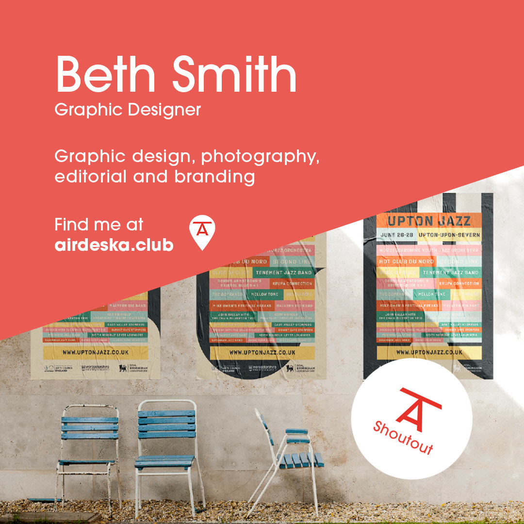
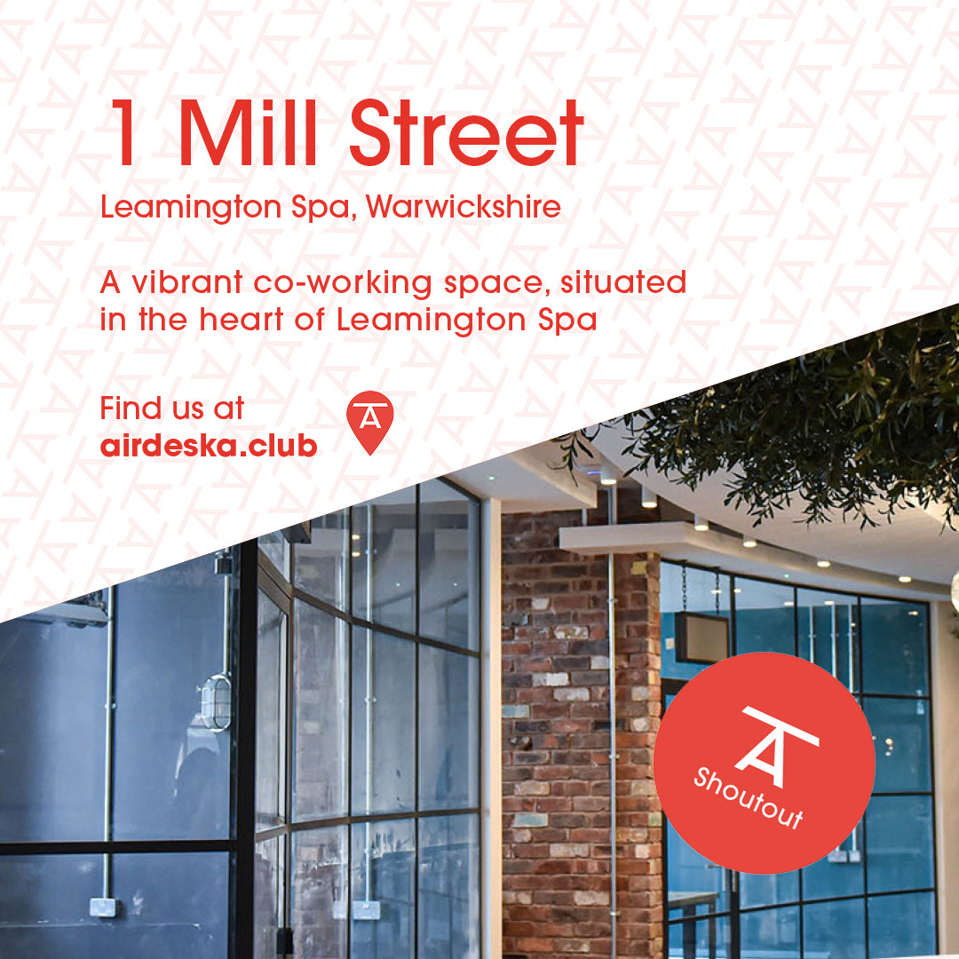
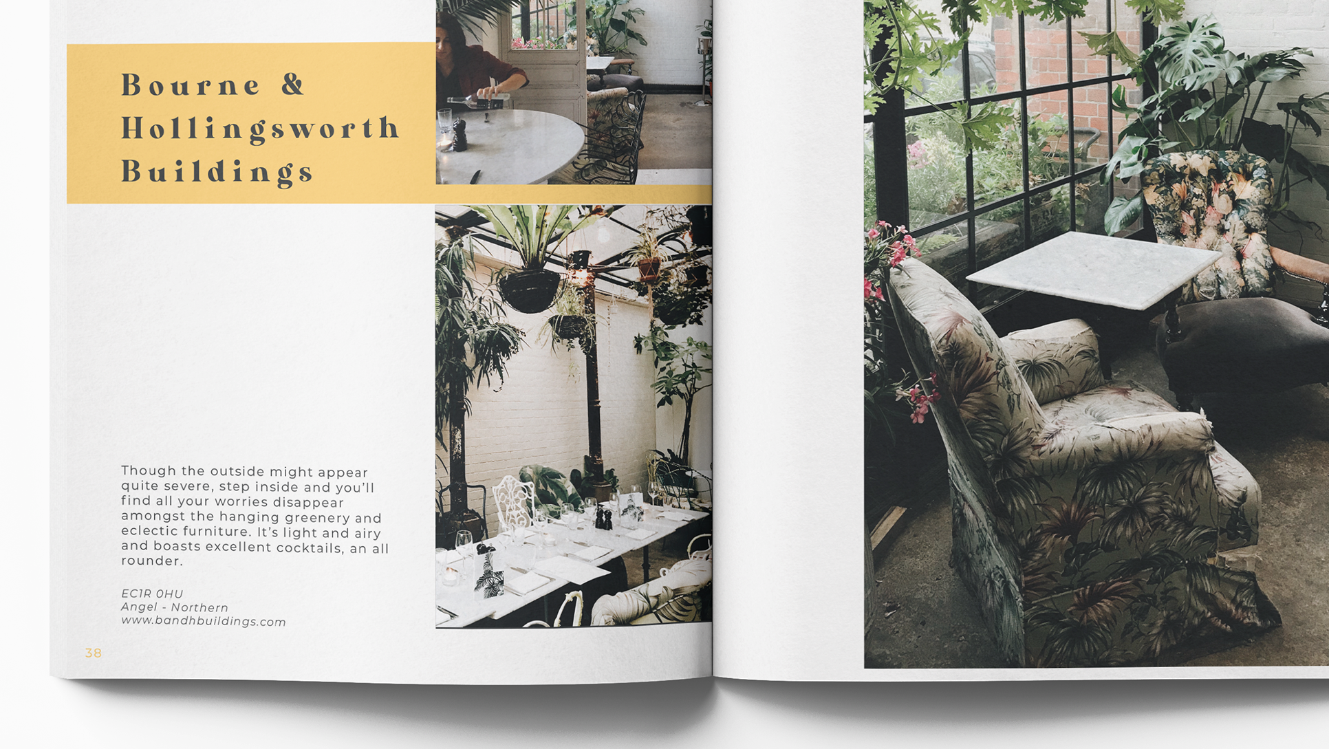
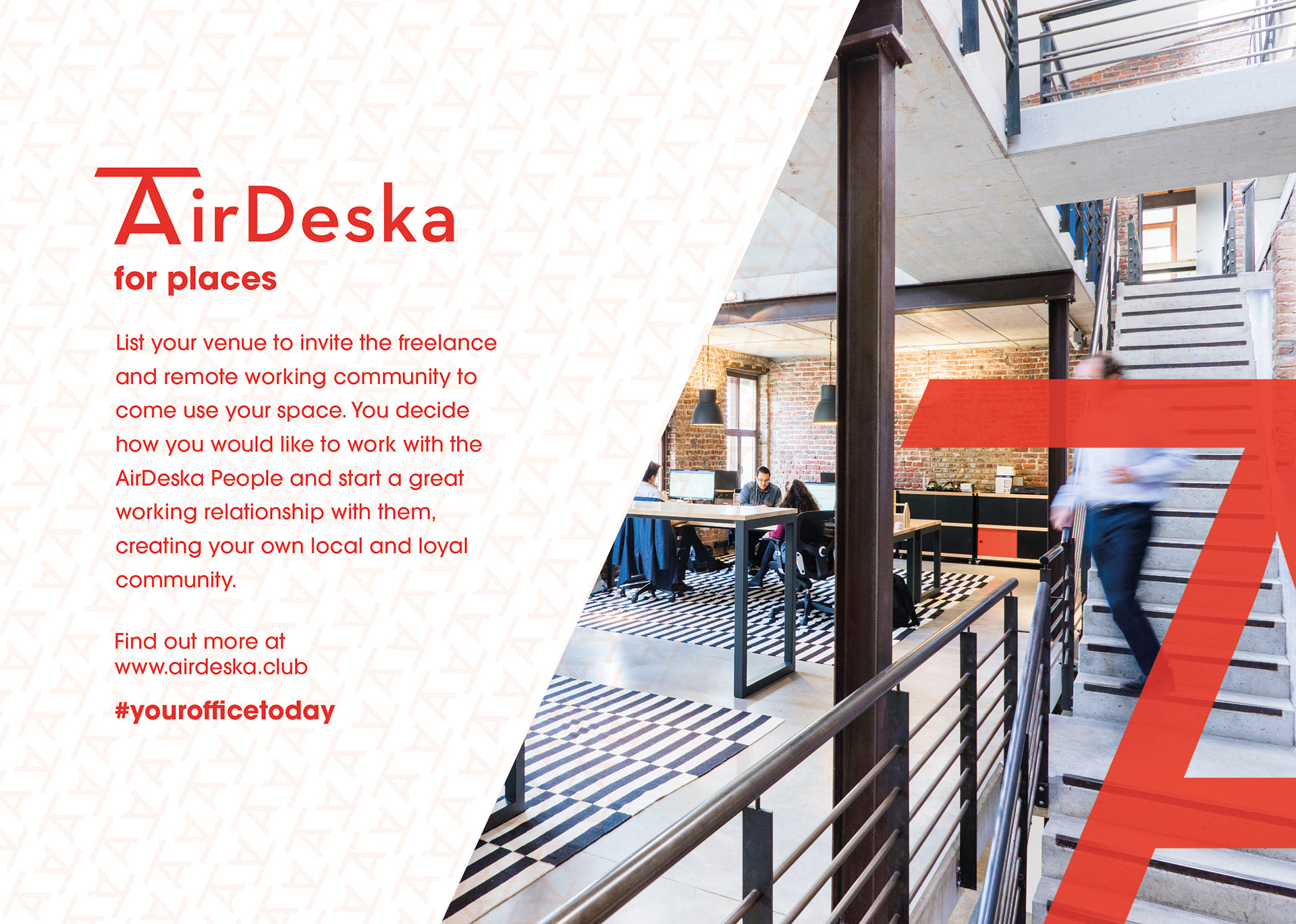
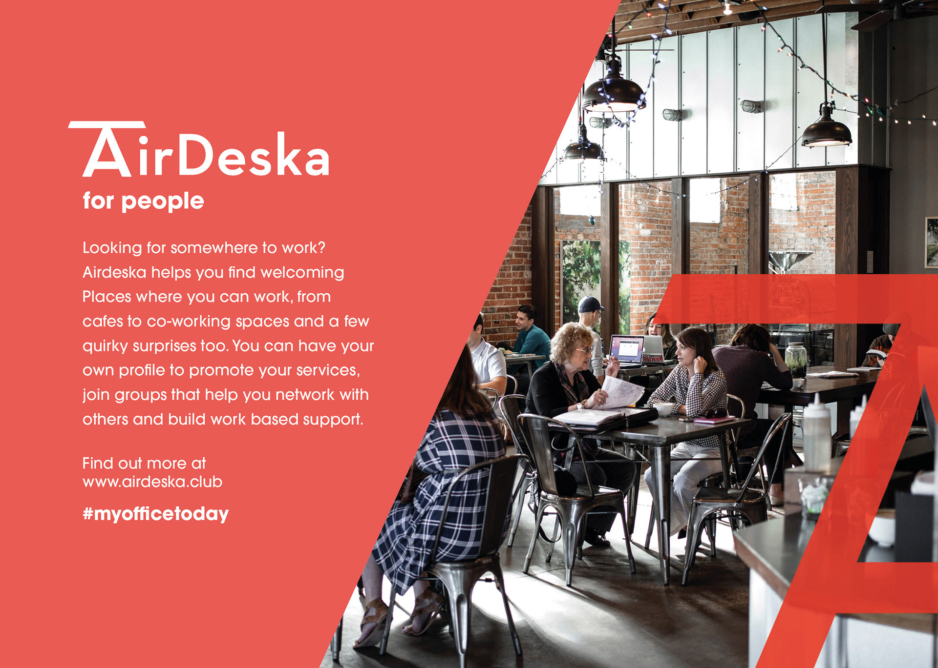
As the business targets two consumers - the People and the Places, we took the angle of the 'A' and used it as a dividing mechanism in the form of a colour block over an image, amongst other uses.
Social content
